18 Oct Anatomy of a Logo: Our New Little Adventure Launches
 Ta da! Our new Little Adventures in Hong Kong website is now officially launched, and we’re thrilled to welcome you to our new “look.” Why a new website? Well, for the usual reasons–our company has grown and evolved since we started three years ago in 2009, and our old site wasn’t keeping up with our changes. We have a terrific new team of hosts and consultants on board. And we have new services that we’ve added, because so many of our Little Adventures clients are either expats and executives based in Hong Kong, or international professionals from the business, art, media, and culinary worlds who come to us for a specific, targeted Hong Kong experience.
So: new focus and services = new look. But what should it be? One of the reasons it took us so long to get around to a re-design is that branding and graphics are kind of like getting dressed up for an important occasion. You don’t want to wear something that looks dumb or sends the wrong signal. (Which is why, when I go to an “important” event, I usually end up wearing the same black dress–it’s not that interesting, but it is foolproof!)
Fortunately, we got very lucky and found the perfect designer to help Little Adventures get a new “wardrobe”–Elizabeth Daggar, of Brooklyn, New York. Liz has never been to Hong Kong (we hope she comes soon!), but she is an amazing artist with a great eye–Liz looked at all the photographs and drawings I brought along to our first meeting, and totally “got” the feeling we wanted to communicate.
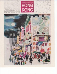
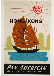
I knew we were clicking by the way she responded to my favorite Hong Kong images, which are not photographs but posters. I’m in love with the mid-century graphic style of the great old Hong Kong travel posters. I’m sure you’ve seen some of these gorgeous advertisements from the 1950s and 60s. It was the golden age of Asia travel, when the possibility of actually going to a faraway place like Hong Kong was something the most people could only dream about. And the posters, filled with exotic images and the terrific colors and typefaces of the “Mad Men” advertising era, were designed to encourage those impossible dreams.
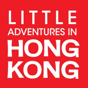
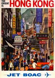 When I told Liz I wanted to get some of that feeling into the look of the new Little Adventures in Hong Kong website, she came up with the idea of evoking that era through our new logo. Those wonderful old fonts from the 1960s were created by hand, so instead of going with some pre-made typeface Liz did us a custom font, drawing a handlettered “HONG KONG”.
What I particularly love is the way she channeled the look of Chinese script without falling into all those kitschy cliches most Western graphic designers fall back on when they’re trying to get something to look “Chinese” (like using what I call the “chop suey” fonts. Liz chose to base the design on a simple bold red square. You may already know that the square is the ideal proportion which every Chinese character is supposed to fit inside. Kids learn to write in Hong Kong by endlessly copying characters over and over on pieces of special paper lined with square boxes. (As an adult learning Chinese that’s what I did too.) Look closely at our logo and you’ll notice something else very cool about what Liz did: she made the lines of her hand-drawn font end with a slightly thicker flourish, to evoke the way that brushstrokes finish on the page when you do calligraphy.
We are so happy with the new logo. It’s bold, clean, smart and communicates what we are now: a professional service that helps our clients bridge east and west, through food, culture, and local intelligence–and helps turn their Hong Kong dreams into the experience of a real, living city.
We hope you like it, and our new website, too. And thanks for visiting us online–we hope you’ll meet us someday in Hong Kong, too.

[facebook]


